FLORAFSLOOLRUATION
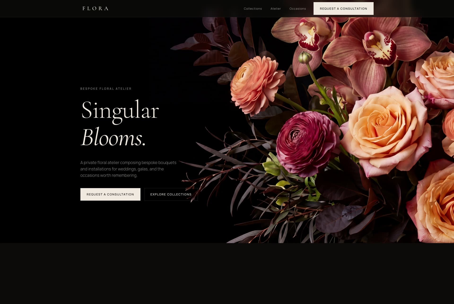
Flora's work is rare and composed by hand, but online it sat next to template florists with stock photos and bright, busy layouts. The craft was singular; the website made it look like everyone else.
- Client
- Self-initiated
- Sector
- Floral Design
- Duration
- 2 weeks
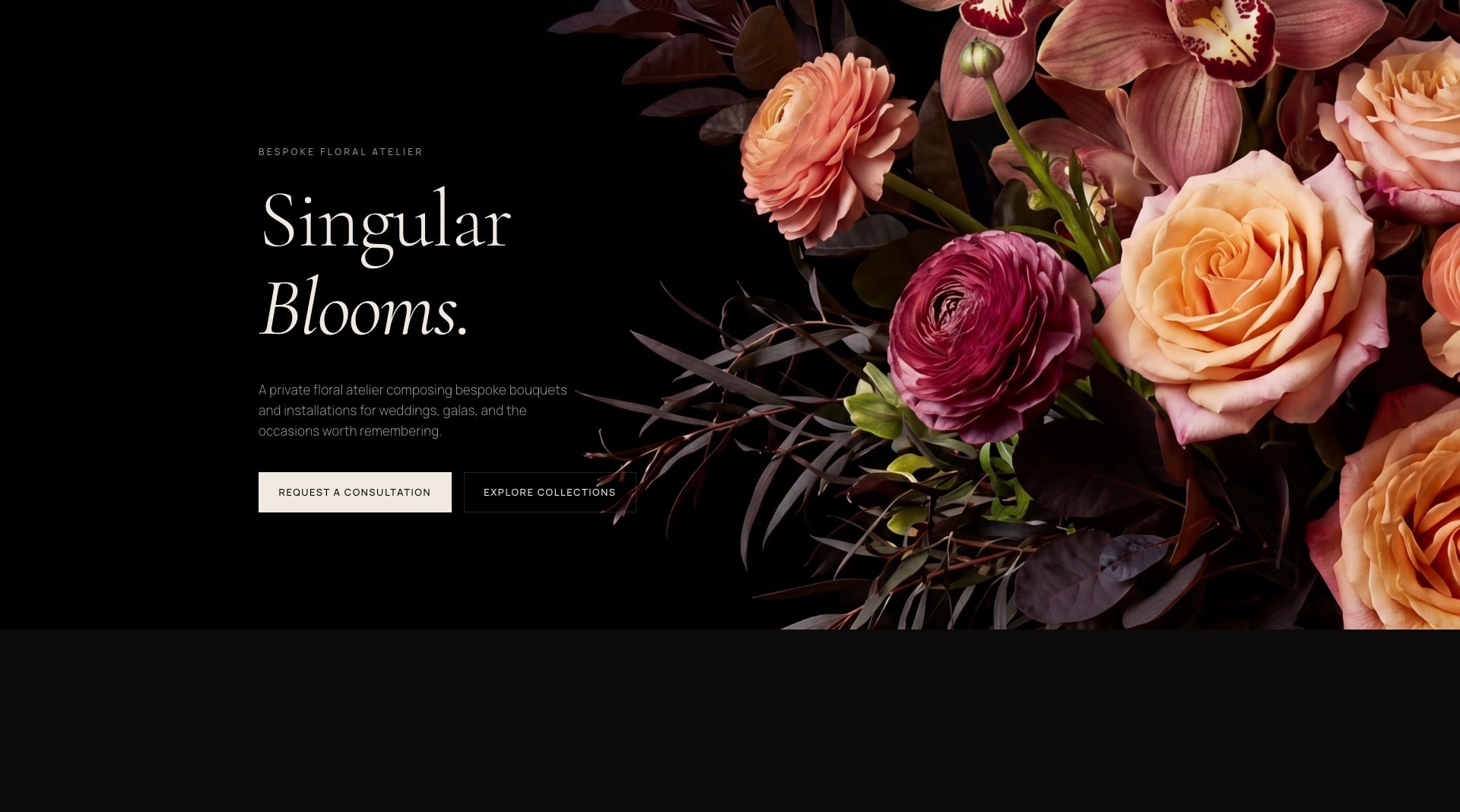
We built a single-page editorial landing that treats every arrangement like a photograph: deep shadow, generous space, a high-contrast serif against a clean sans, and slow scroll reveals. The site sells the atelier's standard before a word is read.
Usually
- Bright, busy layouts
- Stock flower photography
- A grid of every bouquet
- Prices before composition
Mine
- One quiet editorial scroll
- Each arrangement as a still life
- Deep shadow, generous space
- The craft read before a word
Still life, not product shot
Every arrangement is framed against deep shadow with room to breathe, so it reads as a photograph worth keeping, not a product in a shop.
One quiet scroll
No filter bar, no endless grid. A single editorial descent, so the atelier's standard is felt before a price or a category ever appears.
Contrast carries the voice
A high-contrast serif against a clean sans does the talking, so the type holds the same restraint as the flowers it sits beside.
The atelier, not the catalogue
The making leads: sourced by the week, conditioned and composed by hand. The buyer values the craft, not the stem count.
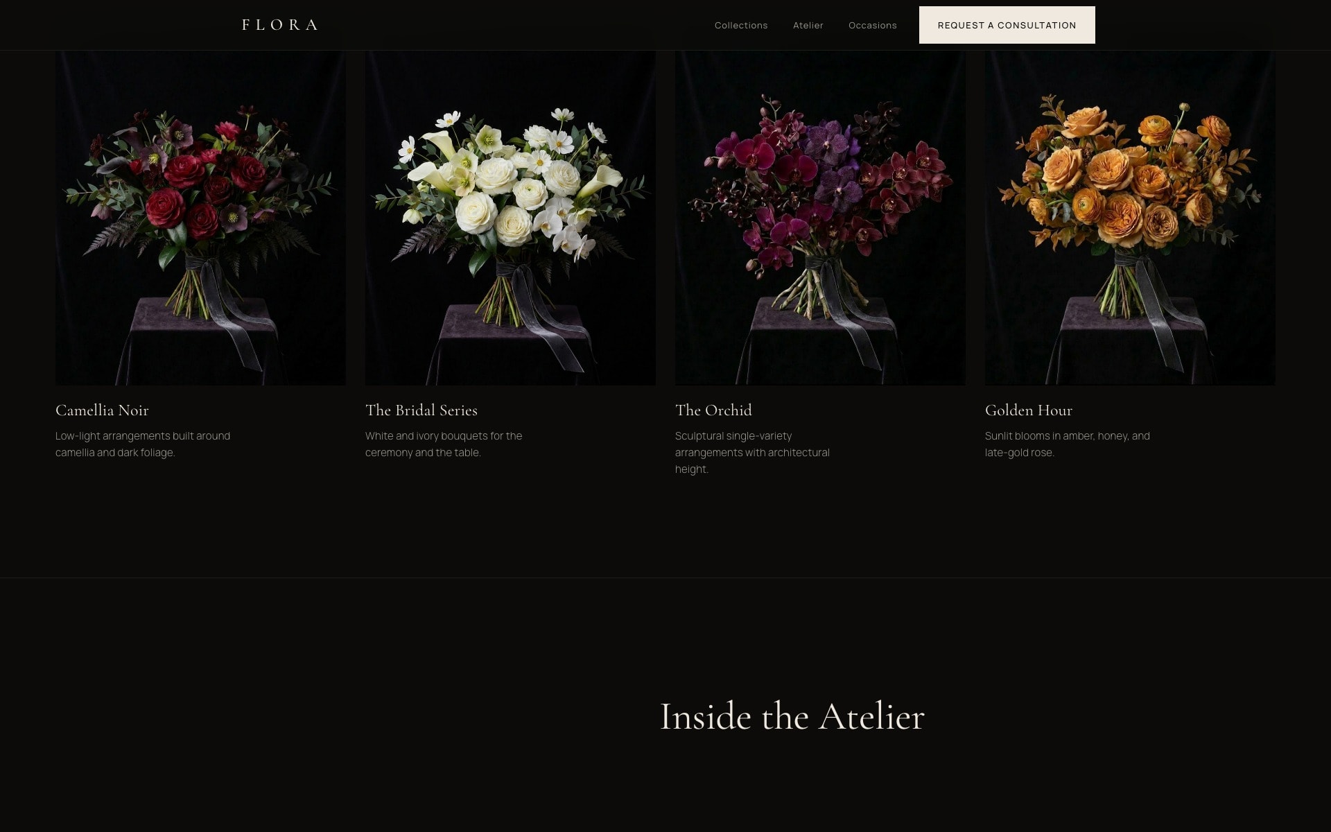
Four ideas, not fifty bouquets
Instead of a scroll of everything, four standing collections, each composed from a single botanical idea. Choice reads as curation, not a checkout.
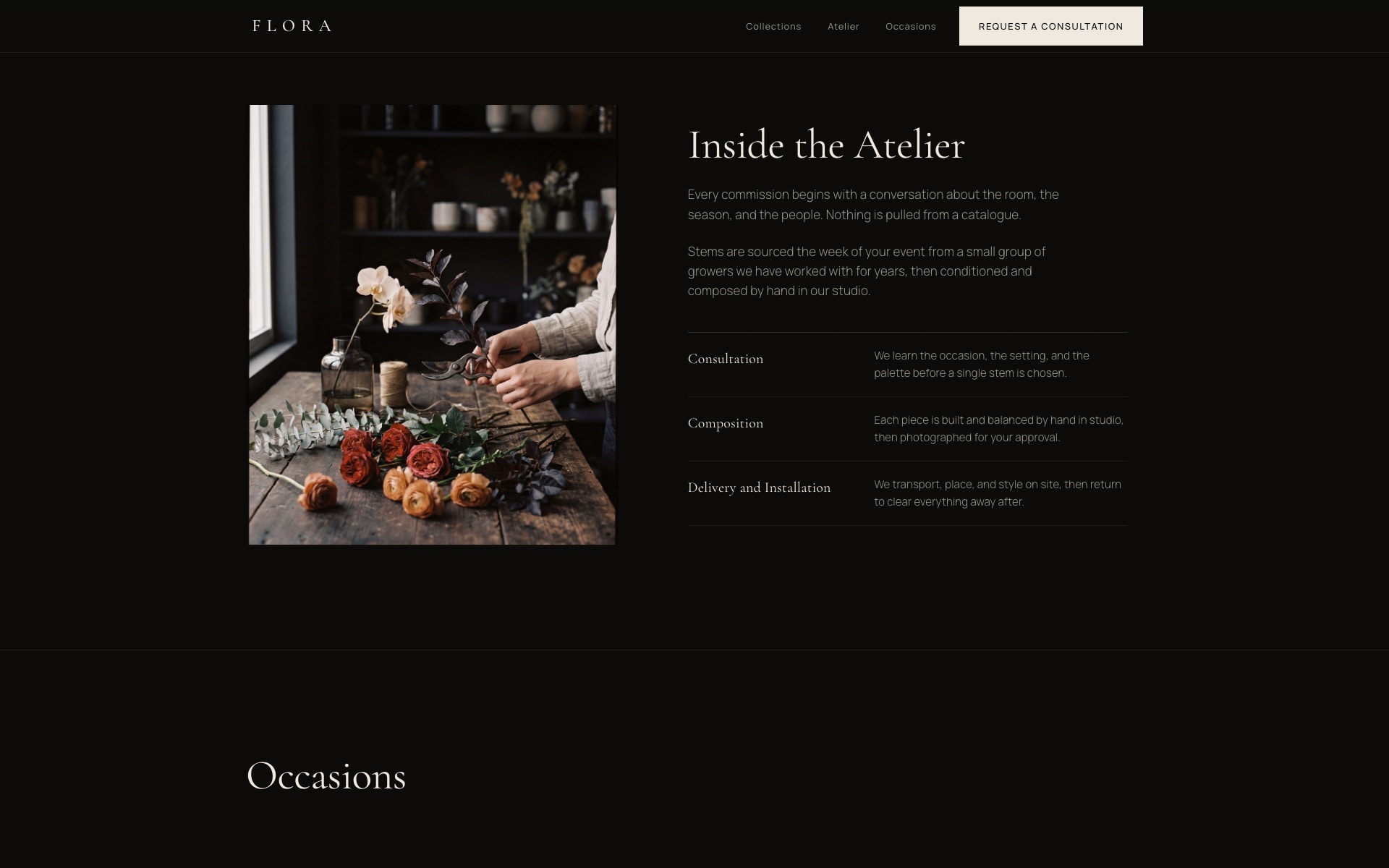
The making earns a section
Consultation, composition, delivery. The hand behind the work gets the same cinematic frame as the flowers, because at this level that hand is the product.
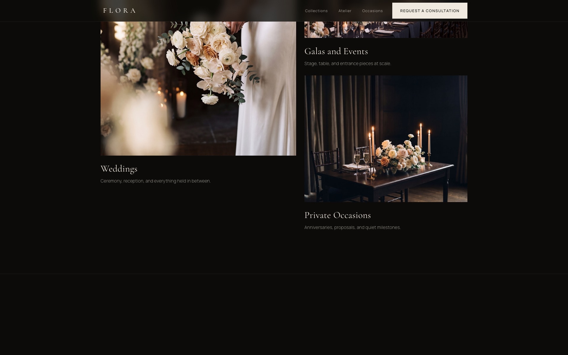
Occasions, not a shop window
Weddings, galas and private occasions shown as moods, not a menu. The site sells the day worth remembering, never the stem count.